Part2.How to choose the right data visualization.
We have discussed in the previous article how can we visualize and present data using raw numbers and which type of charts can be used to show change over time. Moving forward lets see and understand the varied type of charts used.
Charts for showing part-to-whole composition –
The types of charts collected in this section make it much easier to explore the composition and part-to-whole relationships in your data. The main rule here is to occupy the entire chart with the total being 100%. Each part(segment) of the chart represents a data point that contributes to the whole and constitutes 100%.
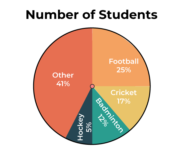
A pie chart is a type of chart that basically looks like a circle divided into sectors (slices). A complete circle (pie) represents the sum of all values in the dataset as 100%. The area of each data point, represented as a slice, is proportional to the value being visualized. Pie charts are useful when you need to show the percentage of each ingredient relative to a specific total amount. A sector of such a chart can not only be drawn inside a full circle, but can also be separated from the rest of the chart into an exploded pie chart. Pie Charts with too many slices are hard to effectively work with.
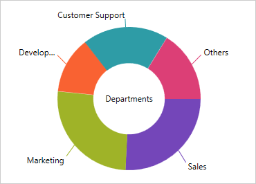
A doughnut chart is a variant of pie chart. The major difference being the empty center ,which can be utilized to provide additional information about the data that is being depicted. Like the pie chart has slices for visualization ,doughnut chart has arc’s. The length of each arc is the perimeter since the corresponding data value is the sum of all values.
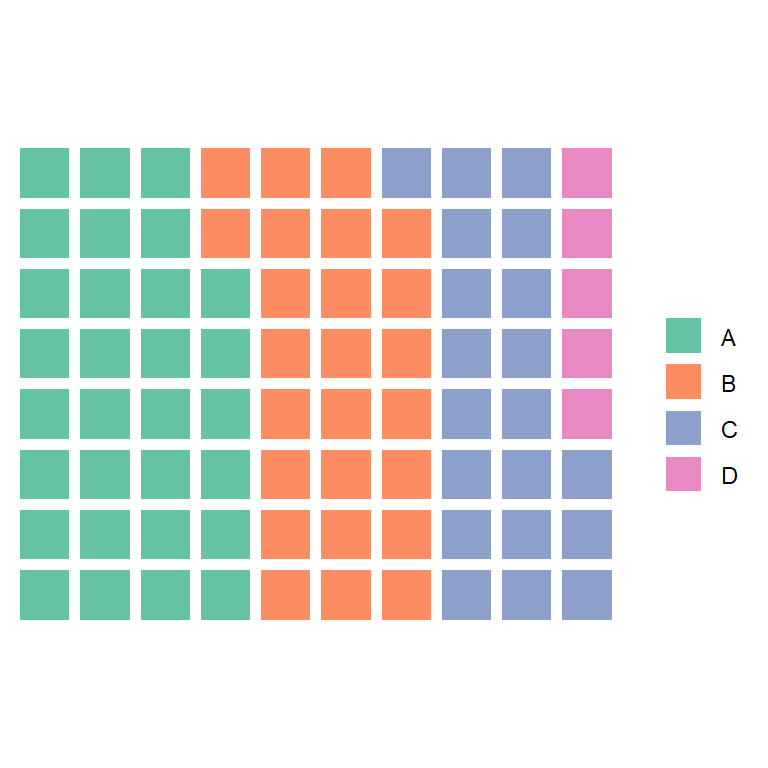
A square display consisting of 100 small squares in 10 -by-10 layout is a waffle chart. Each square represents one percent of whole. It is easier to read to read as compared to the Pie- chart. Squares are colored according to the data represented.

A stacked chart is a type of bar chart that shows the composition and comparison of several relative or absolute variables over time. Also known as a stacked bar chart or stacked column chart, it looks like a series of vertical or horizontal bars stacked on top of each other. Stacked charts are very effective comparison tools when used correctly. They are designed to compare totals across categories.
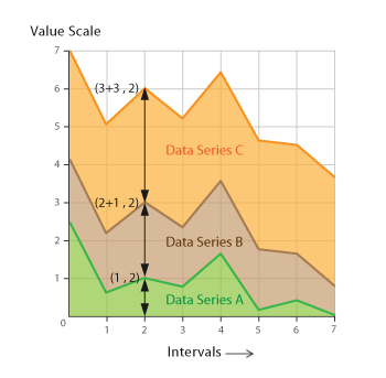
A stacked area chart plots multiple area series stacked on top of each other. The height of each row is determined by the value of each data point. A common use case for stacked area charts is to analyze how multiple variables, each and their sum, vary on the same chart.
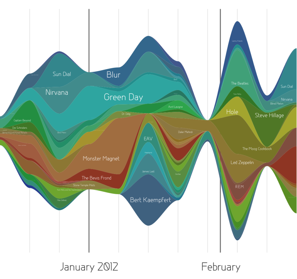
A power diagram or current diagram is a type of stacked surface diagram shifted around a central axis, resulting in a fluid, organic shape. Unlike traditional stacked area charts, where layers are stacked on one axis, in power charts, layers are arranged to minimize “wobble”.

A waterfall chart shows a running total as values are added or subtracted. It helps to understand how the initial value (such as net profit) is affected by the range of positive and negative values. The columns are color coded so you can quickly distinguish between positive and negative numbers.
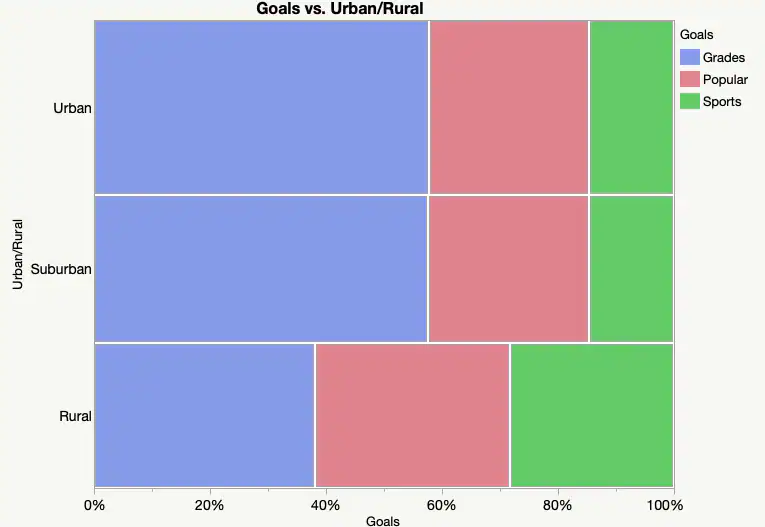
A mosaic chart is a special kind of stacked bar chart. For two variables, the column width is proportional to the number of observations at each level of the variable plotted on the horizontal axis. The vertical length of the bar is proportional to the number of observations of his second variable within each level of the first variable.
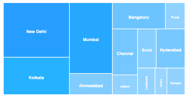
Treemaps are ideal for representing large amounts of hierarchical (tree-structured) data. Space within the visualization is divided into rectangles whose size and order are determined by quantitative variables. Levels in the treemap hierarchy are visualized as rectangles that contain other rectangles. Each set of rectangles at the same level in the hierarchy represents a column or expression in the data table. Each square at a level of the hierarchy represents a column category.
Charts for depicting flows and processes –
A more specialized use for charts related to decomposition of a whole is
the tracking of the flow of amounts across a multi-stage process. At their
most advanced, these charts can efficiently show how multiple inputs are
transformed into multiple outputs.
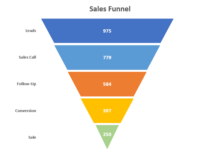
A funnel chart is a special kind of chart that shows the flow of users in a business or sales process. The diagram gets its name from its shape, which starts with a wide head and ends with a narrow neck. The number of users at each stage of the process is displayed as a narrower funnel.
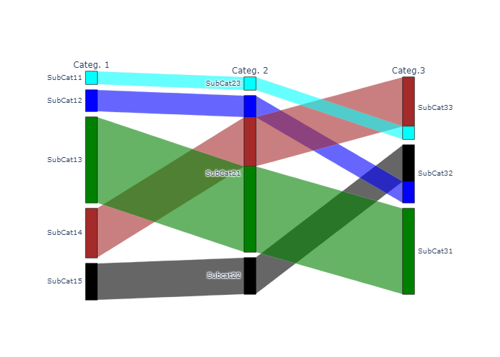
Parallel sets are similar to Sankey diagrams in the way they represent flows and ratios. However, parallel sets do not use arrows and instead divide the flow path at each set of lines shown. Each line set corresponds to a dimension whose values and categories are represented by each line division of that line set. The width of each line and the resulting flow path is determined by the proportional distribution across categories. You can color-code each flow path and compare the distributions between different categories.
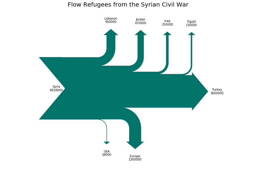
A Sankey diagram is a type of flow chart in which the width of the arrow is proportional to the flow rate. Sankey diagrams can also visualize energy balances, material flow calculations at the regional or national level, and cost breakdowns . Diagrams are often used to visualize material flow analysis. Sankey diagrams highlight the most important communications or flows within a system. It helps you find the most important contributions to your flow. It often indicates the amount saved within defined system boundaries.

A Gantt chart is a useful project management tool for planning and scheduling projects of all sizes, but it’s especially useful for simplifying complex projects.
There are few more types of visualization which we shall discuss in the next series.
