Part 1: How to choose the right Data Visualization.
Data visualization is an integral part of data analysis. Ability to graphically and efficiently summarize large amounts of data. It’s amazing how much knowledge can be conveyed in such a limited space. Use data visualizations to easily convey message. This allows to grasp insights in the quickest and easiest way.
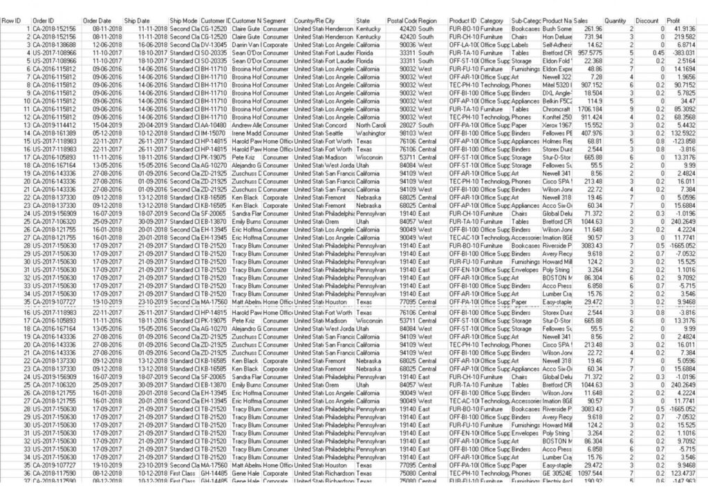
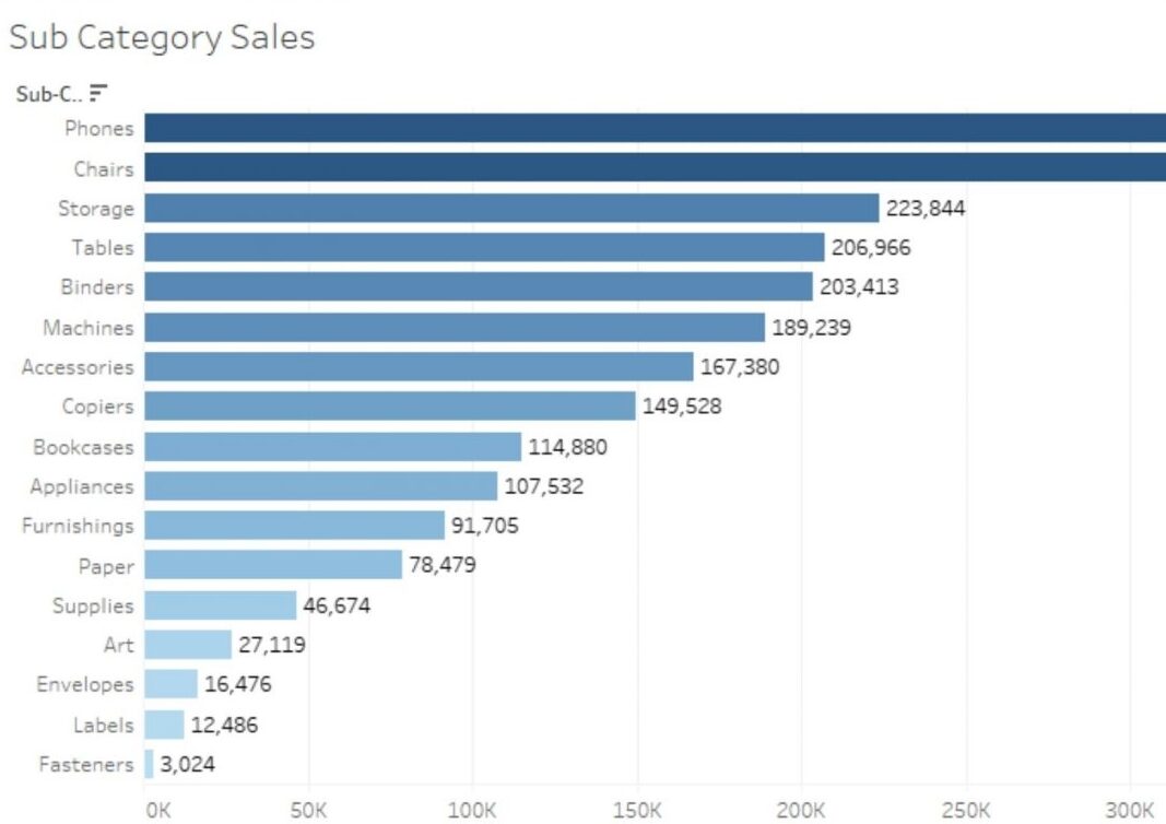
So, which picture makes more sense and which one helps in analyzing data more accurately and efficiently.
Benefits of Data Visualizations:
- It helps convey the right message through images.
- It helps to find outliers in data.
- Help managers make accurate decisions.
- It helps you understand how data is distributed over time.
Different types of charts are available, each with their own strengths and use case. One of the most difficult parts of the analysis process is selection. It’s the correct way to view your data using one of these visualizations. Before deciding on which chart type to use, one needs to ascertain the type of role the chart will serve.
Common roles for data visualization include:
- Showing change over time.
- Showing a part-to-whole composition.
- Depicting flows and processes.
- Looking at how data is distributed.
- Comparing values between groups.
- Observing relationships between variables.
- Looking at geographical data.
Next, consider what kind of data you want to represent. Chart type Usage depends on whether the data is categorical, numeric, or a combination of both. Certain visualizations can also serve multiple purposes it depends on these factors.
We shall be discussing about 2-3 visualization types per article, each with multiple chart types to cover common types of data and subtasks.
Raw numbers: Just showing the data.
It is not always required to depict the data on charts and graphs, at times the most effective way of representing data is presenting it as text.
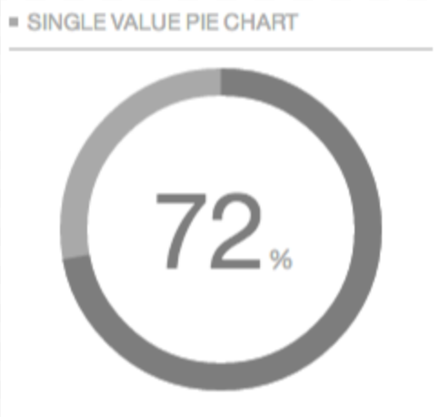
Single value chart-When there is only one number to show, then presenting it as it is, is the best thing to do. It cant be shown graphically as there would be nothing to compare or show.
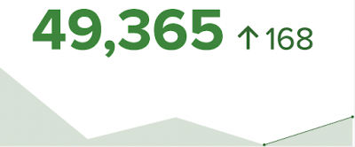
Single value with indicator– Single values can be visualized with different indicators to compare between the first number and second number.

Bullet Chart – A bullet chart is a bar marked with an additional code that indicates progress toward a goal or performance against a baseline. Each bar brings more visuals to focus the user on her one metric and provide additional detail. A bullet chart consists of bars representing metrics of interest. This bar is distinguished from the rest of the chart by its thick color and thick line. located in the middle of the chart. Reference lines indicating targets or other critical thresholds are drawn perpendicular to the bars on the quantification scale axis. When the main bar passes the reference line, the goal has been reached or the status has changed.
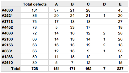
Table – A data table or worksheet is an efficient format for comparative data analysis of category objects. Typically, items to be compared are arranged in columns and category objects are arranged in rows. Quantitative values are placed at the intersection of rows and columns called cells.
Charts for showing change over time.
Change in numeric value is one of the most common function of data visualization. Mainly for a feature or across time lines. To depict change over time the charts usually represent time on the horizontal axis -from left to right and interest values on the vertical axis .There are various charts that show this kind of visualization.
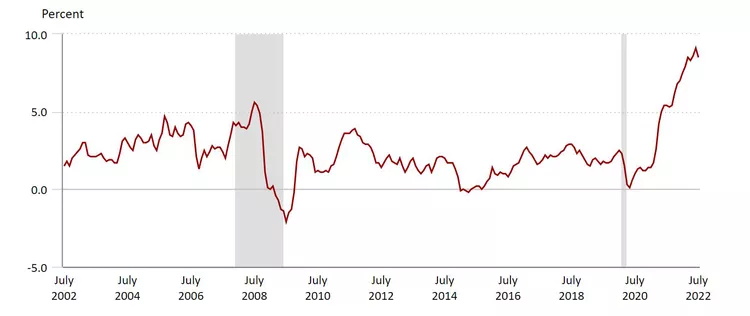
Line Chart
A line chart (also called a line chart or line chart) is a chart that uses lines to connect individual data points. A line chart displays quantitative values over a specified time interval .A line chart connects individual data points and usually shows a quantitative value over a specific time interval. Data on line chart is depicted on horizontal and vertical axis, known as x and y axis respectively. They are used in various fields to show changes over a period of time.
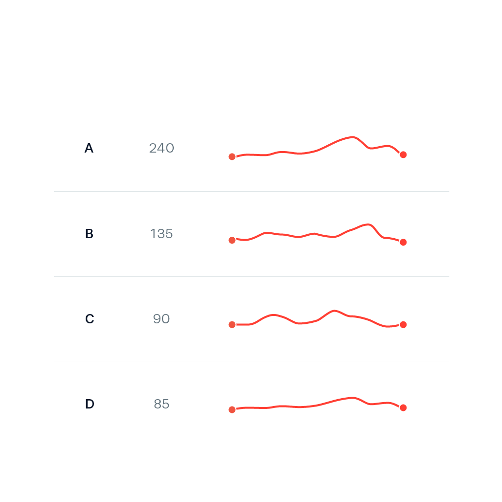
This chart has very little to no labelling and is usually placed beside text or tables. It provides high level overview without drawing too much attention.

Different units of measure are compared. Line segments connect points over time, at time they go from right to left. The are alternative to dual axis chart.
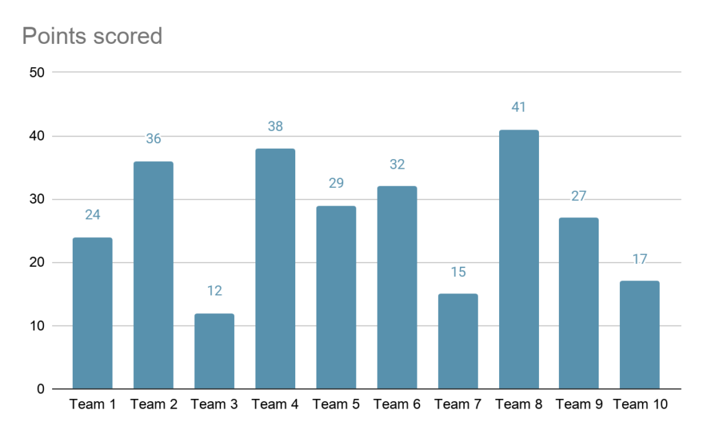
Bar chart uses horizontal or vertical bars or strips to compare and contrast different type of data, frequencies, other measure of categories of data. Its a pictorial representation of data ,where the length of bars are proportional measure of data.
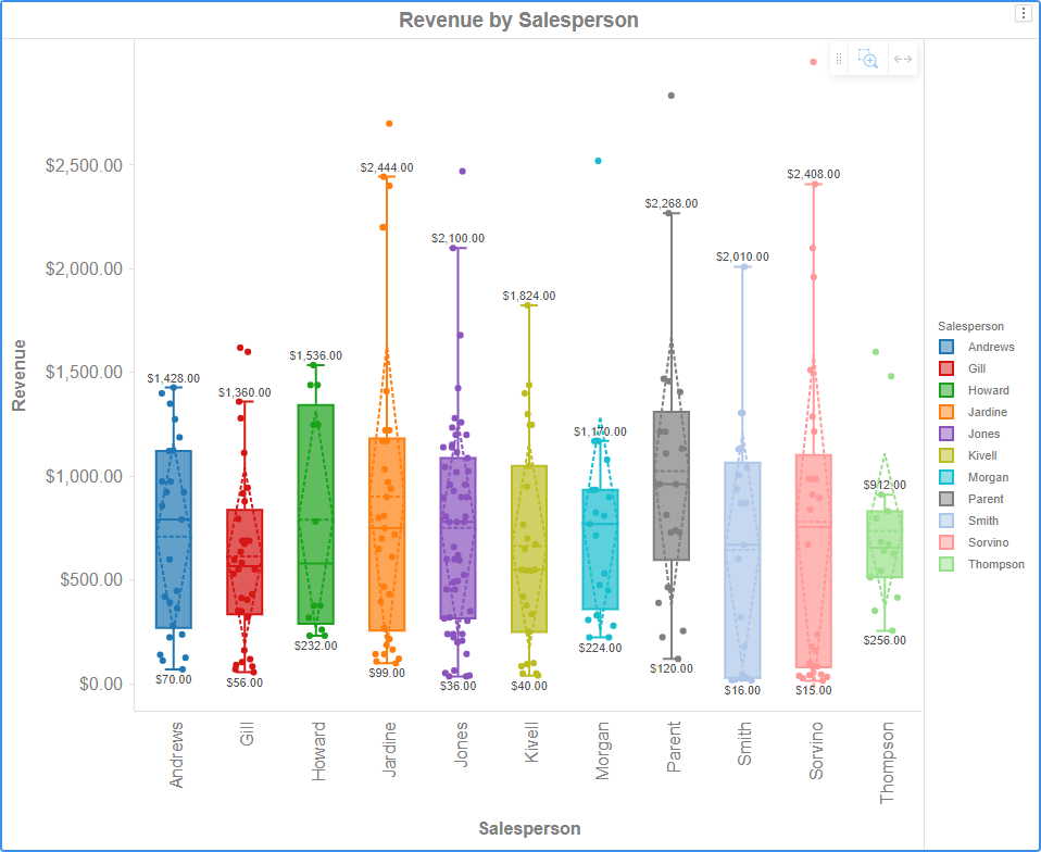
Boxplot
Boxplot visualization allows you to explore the distribution of your data. A boxplot is displayed for each attribute element. Each boxplot displays the minimum, first quartile, median, third quartile, and maximum values. You can also display the mean and standard deviation as dashed lines.
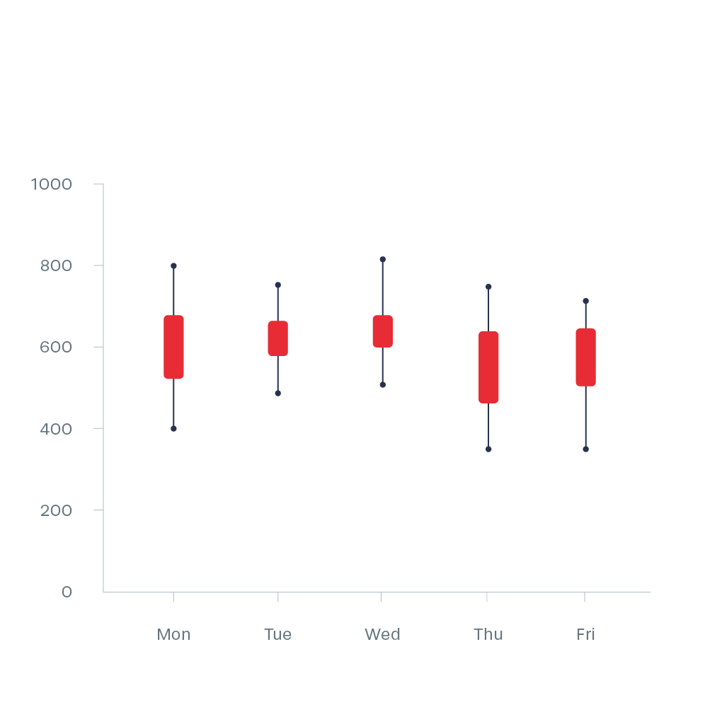
Candlestick Chart
Candlestick visualizations are used in analytics to show the high, low, open, and close prices of stocks, etc. over a specific period of time. The wide part of the candlestick indicates whether the closing price is higher or lower than the opening price.
We shall explore more types of data visualizations in the next article of this series.
